In this tutorial we will learn how to create a quick, smooth and glossy a web2.0 icon. Even though the beauty of design lies in detail, we will try to make an icon in 10 steps.
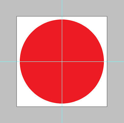
Open a document 300×300 px.
Draw guides to to make a center point. Create a circle of 250×250. Apply a color. Here I have put a red color #ed1c24.
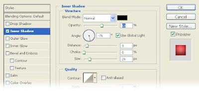
Lets apply some effects. Go to the layer style blending options and apply Inner Shadow
Change the gradient to
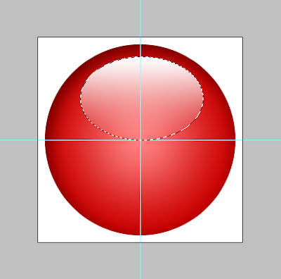
After applying the result will be like this
Make a new layer. Draw a ellipse with marquee tool as shown below. This is the main reflection layer.
Select white color as foreground. Select the foreground to transparent fill from the gradient fill.
Fill it. It will be starting with white and blending down to red background color. Change the layer transparency to 65%.
To make an outer ring draw another one ellipse of 15px more that the first drawn one. Set the thickness on the outline depending on what size you are going to use the icon size. Fifteen pixel will be fair enough for a 50px - 60px icon.
Apply the following settings for the ring. First we will apply gradient settings from the layer style.
Change the style of the gradient to reflected.
Angle to 13 degree. Scale to 110.
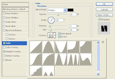
Apply the following settings for Satin.
Change the angle to 59 degree. Distance to 9. Size to 16.
Below you can see the contour settings. Click the anti-aliased and invert check buttons.
Make a new contour as shown.
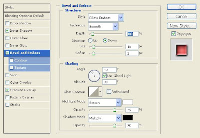
Apply a pillow emboss for the inner red ellipse to stand out a little more.
From the symbols font select any one and put it below the reflection layer. Here i have used an home symbol. I gave a little black outer glow, bevel and emboss, gradient overlay and stroke. This is the basic layer required to make an icon.
By changing the settings and adding a layer you can modify like below.








0 Comments:
Post a Comment